Uploaded by Torvusil 


1500x1802 PNG 517 kB
Interested in advertising on Furbooru? Click here for information!

Furbooru is not cheap to operate - help support us financially!
Description
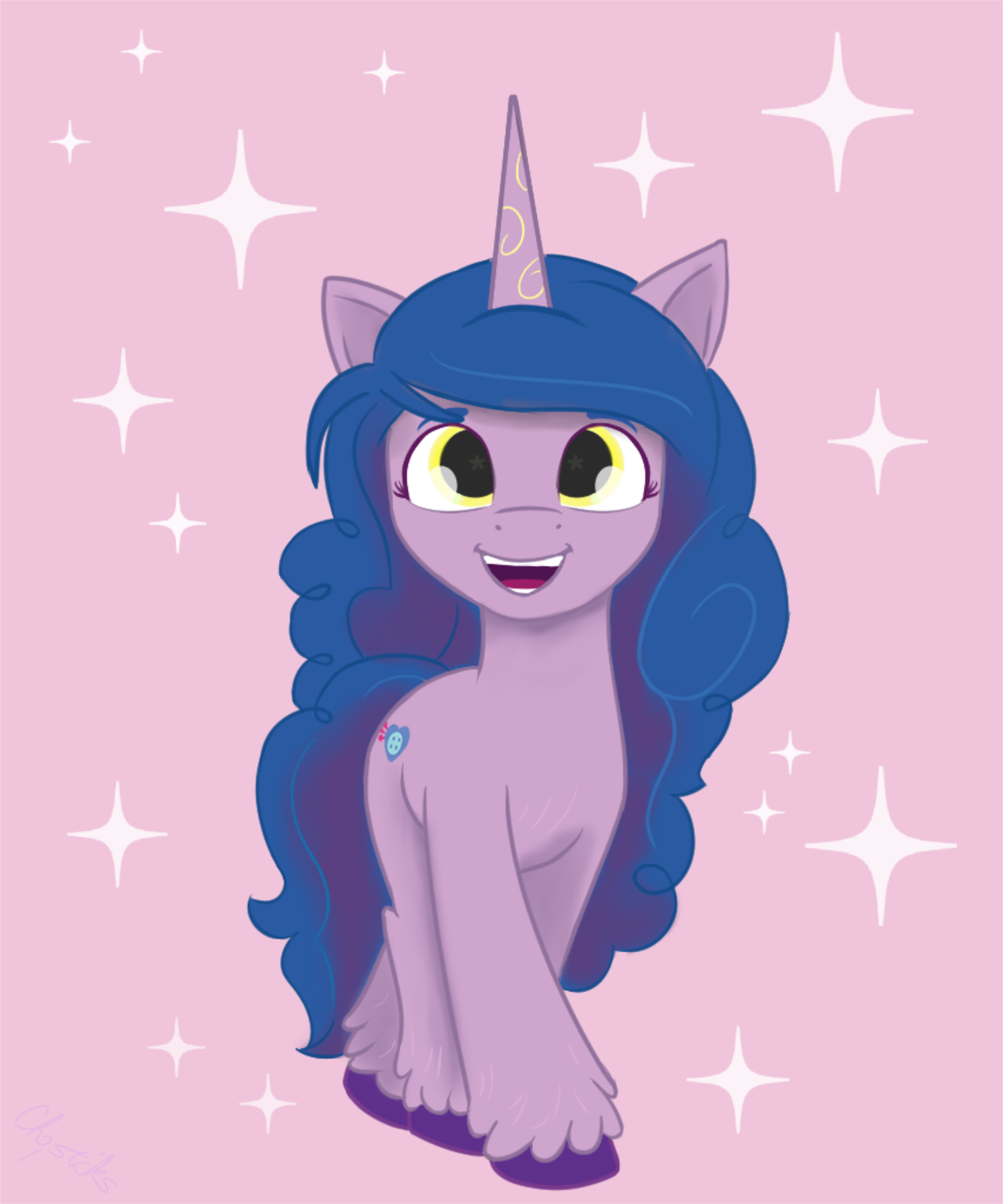
I actually think the pony style design we saw was fine, but I did see what people were saying about them looking a bit creepy and out to steal your soul. So I tried being as faithful as possible with a few minor adjustments.For reference to the original design: derpibooru.org/images/2556884NOTE: I’m not saying what we saw was ugly, nor totally horrible, and I’m not saying, “Oh look at me, I can do better,” so withhold the unnecessary accusatory comments. I’m just performing an artistic exploration and practice.
.So I don’t know what the operation setup at Boulder Media is (if they’re the ones who produced the specific art we saw), nor can we see what kind of corporate meddling could be taking place behind the scenes.Most likely, the designs were a collaboration effort with what looks like some obvious input from Imalou’s structure preferences; but her approach is so rich, delicate, and subtle it requires more information to interpret correctly (i.e. shading/lighting); can’t quick fix easily with adding lines. And the designs we previewed were obviously mellowed down, oversimplified versions (and we don’t know why; could be just for ease of factory-producing animation, placeholders on the merch, etc.)What I Changed
The dull strength of the darkness in the eyes, could be creating that ‘dead fish’ syndrome; their smallish size and centering of the eyes also produces that creepy blank stare. None of these are really bad, just in combination doesn’t come off as warm and joyous (especially in comparison to G4).I did think the stars for directional line-of-sight were kind of interesting. According to what I see, they position them exactly how I do with my eyes, just with stars. Same with the reflections, just with ovals. It’s very simple and easy to work with IMO.I also noticed some odd discrepancies with the eyes in the trio pic from the pillow design; whoever put that together I think misunderstood some of the reflection color changes in the iris band and it throws off a lot more than it should.
.And of course the upturned, squarish orangutan mouth is a bit unsettling. So I tried adjusting some of that a little. Not very graceful my touch, but hopefully simpler and not so creepy. I also slimmed down the cheeks (they really shouldn’t be that wide if they’re going for the type of mouth they chose). And I know that G4 show style keeps the muzzle and mouth closely connected, but the gentle pointing tip of the mouth lets the animation get away with it. Here, not so easy.It feels like the eyes and mouth were based off corporate yahoo demand ‘requests’ to get a throwback to older generations.
.I’m not a fan of the color gradients; they feel choppy and childish, like when you give a novice artist access to textures and gradient effects and they jam it into basic line art and it clashes terribly. Could be worse of course.So I kept the color gradient concept and applied them to some shading and used the brightness of some hair whisks to complete interest. This would also be a lot easier for animators to keep up with and understand IMO, and eases a bit more of that depth of information into the 2D design. I dunno maybe the lighting/shading artist(s) involved quit or were cut as a department to save the budget; I know shading work doesn’t come cheap (and such artists working that department know it) and really amplifies the animation. But for Celestia’s sake, if they’re going to have complex gradients anyway might as well shift it to their responsibility instead of whipping the colorist or special effects department to work overtime.
.Another minor thing was the golden trim on the horn. It’s… different; I think it could work. Just making it glow and there you go; magic aura. But it’s very hard to see in the initial design so I just brightened it up. I also felt the golden yellow would make a great contrast color for the eyes. The original already dulls the depth with its color and adding a color matching too closely to the coat just deadens the eyes even more.But something I found odd was that the horn in the original images are of a lighter shade, to the point it kinda looks like a different color was intended. It makes it look like she’s wearing a party hat on close inspection. So I reverted it to her coat color.
Comments
0 comments posted